
The SiteRx Design Library
Timeline: January 2022 - February 2022
A Figma library created to standardize components for efficient design and
development processes.

Problem Statement
The original design library was disorganized, inefficient, and inconsistent. Components were built ad-hoc and weren’t scalable for other use cases.
Background

Business Goals
Build a source-of-truth design system library for efficient, cohesive design files and cross-functional collaboration development processes.
Cohesion
Efficiency
Organization
The 1.0 Design System Library was lacking consistent design choices and clear organization for the vast array of components.
Components were created without clear direction.

Before Redesign

Pages were organized by features,
rather than components
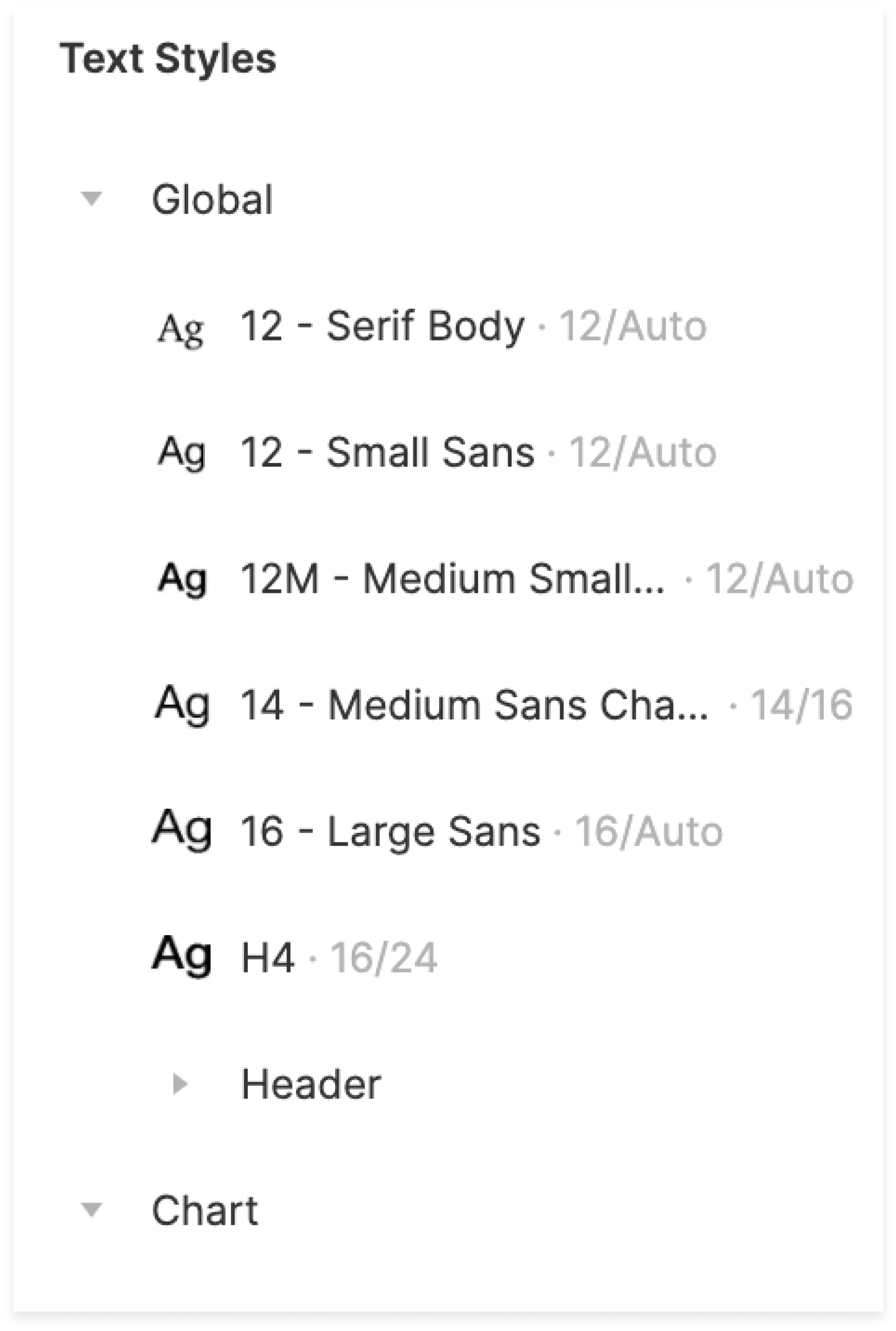
Text styles required more clarification
and guidelines before use
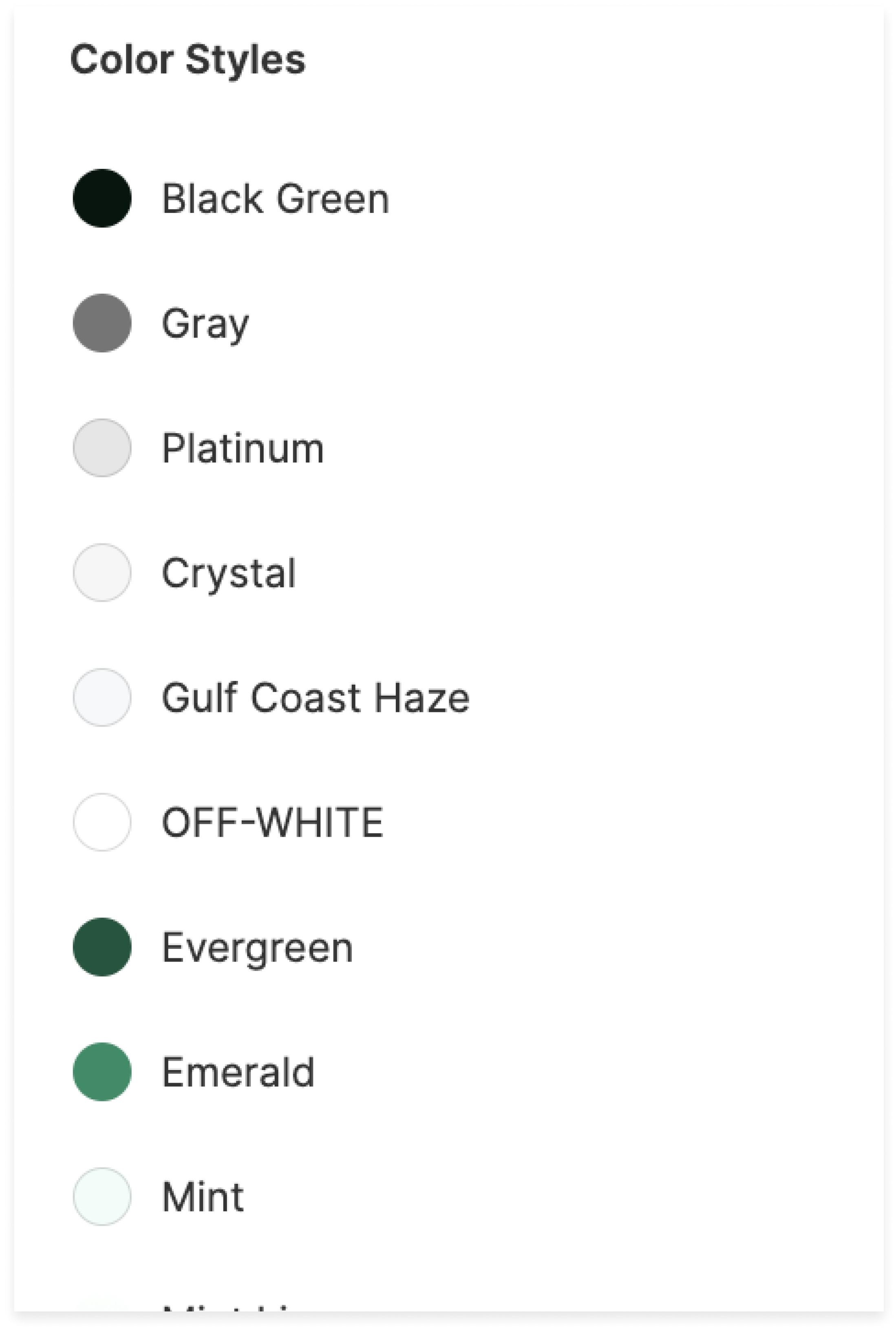
Color styles were named uniquely,
lacking clear rules
The 1.5 Design System Library introduced a file structure organized by component types, featuring cohesive design choices across the collection.
Components are robust and specific, with various states.

After Redesign
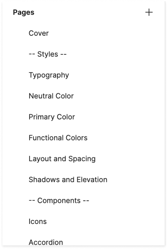
Pages are organized by styles
and individual components
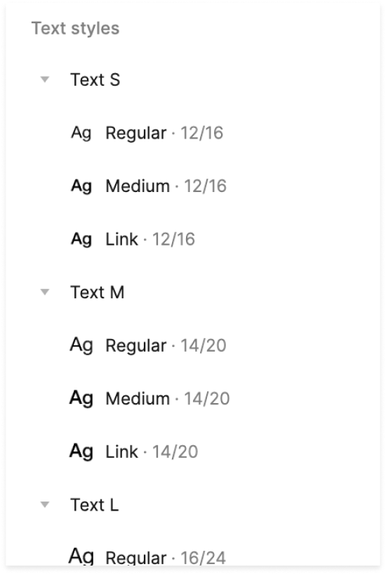
Text styles are organized
by size and use cases
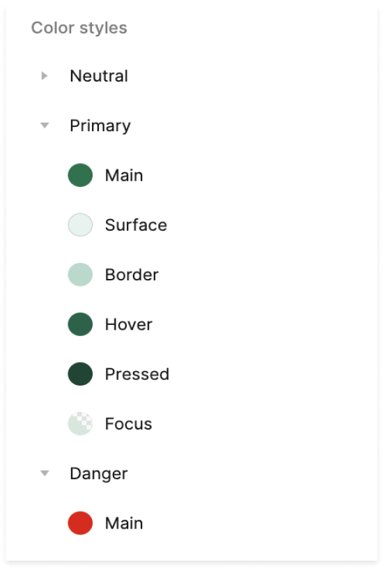
Color styles are named
to communicate functionality

The Outcome
Pain Point Solutions
01
Clarified file organization
02
Components built with flexibility
03
Stylization and usage rules
A Robust
Documentation Library

Component Organization
By laying out the components in a clear visual manner, both developers and onboarding designers can easily understand style choices and usage rules.
Big ideas, real value.
Cohesion
I designed over a dozen component types while prioritizing a clean, modern look and feel. Each component was designed with variants for different states, leading to a more cohesive system overall.
Efficiency
The design and development teams were immediately able to capitalize off the new and improved design system, using it to redesign the existing product faster than ever before.
Organization
I presented the new system to the design and development teams, walking them through how to navigate the new files. On all new design files, I included a cover page including a link to the design library and documentation library for easy navigation.